(… with A.I. approved title, but human approved design 😀 )
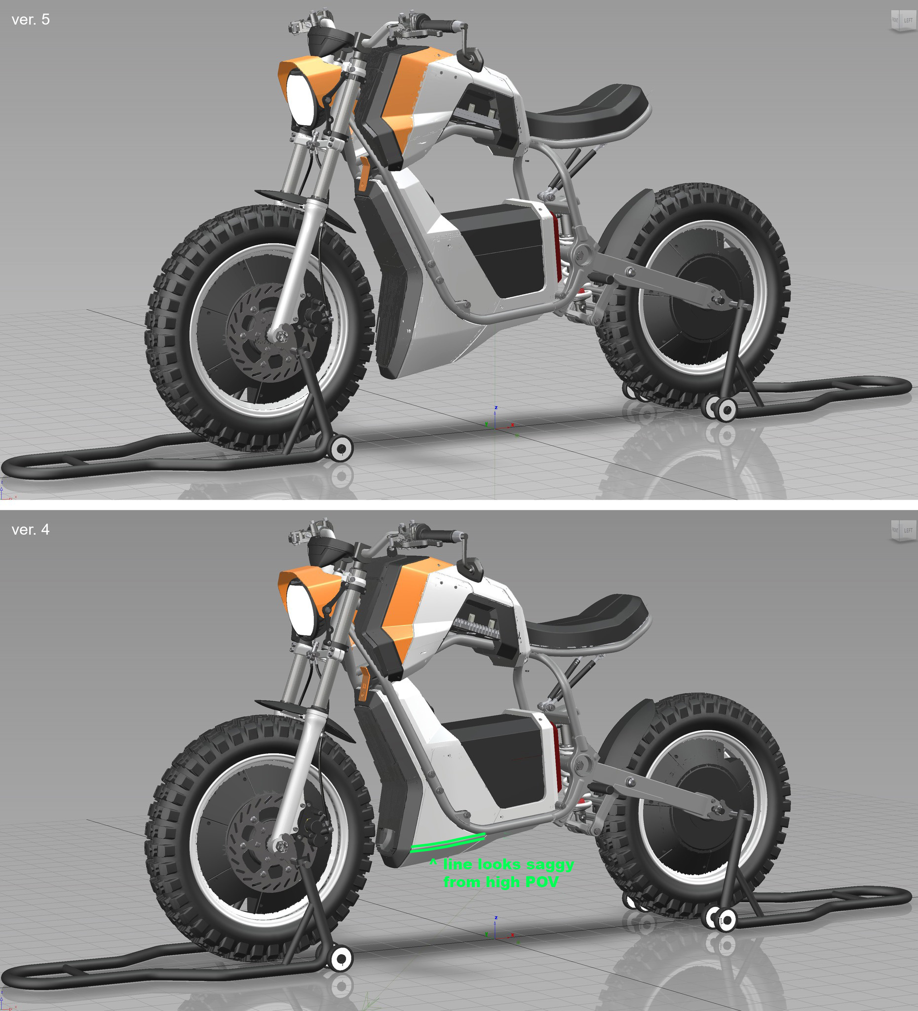
I know I froze the design a while back, but a particular area broke the freeze. While I had the opportunity I thought I’d try another option for the front of the battery case. It’s wasn’t working for me aesthetically.
From a real eye point of view, when you stood next to the bike*, a lot of the surfacing at the base of the battery box casing were not visible. This drew attention to lines that misdirect the eye and make the case look saggy at the bottom instead of making the bike well stanced, aggressive and edgy. The more I looked at it, the more I found the surfaces and the line visually offensive. I hated it. So, as a solution I thought I’d try to drop the battery case surfaces under the frame to see how that works… and of course, new prints to check it out in person.
* a view point a typical rider would engage with a lot (every time they mount the bike).

One Comment Add yours