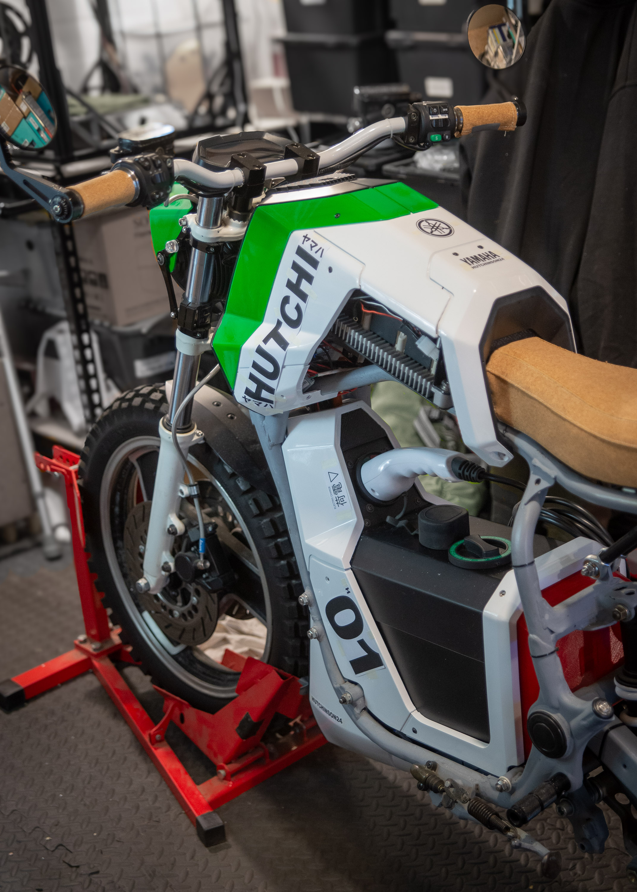
I’ve spent a while polishing the panels after giving them a 2K clear coat and now thinking of next steps. As there was a shift towards an younger more modern look midway through the design phase (it was looking too old fashioned), one design task I thought would be useful to embed the design into a younger marketplace would be some custom decals — could be fun.
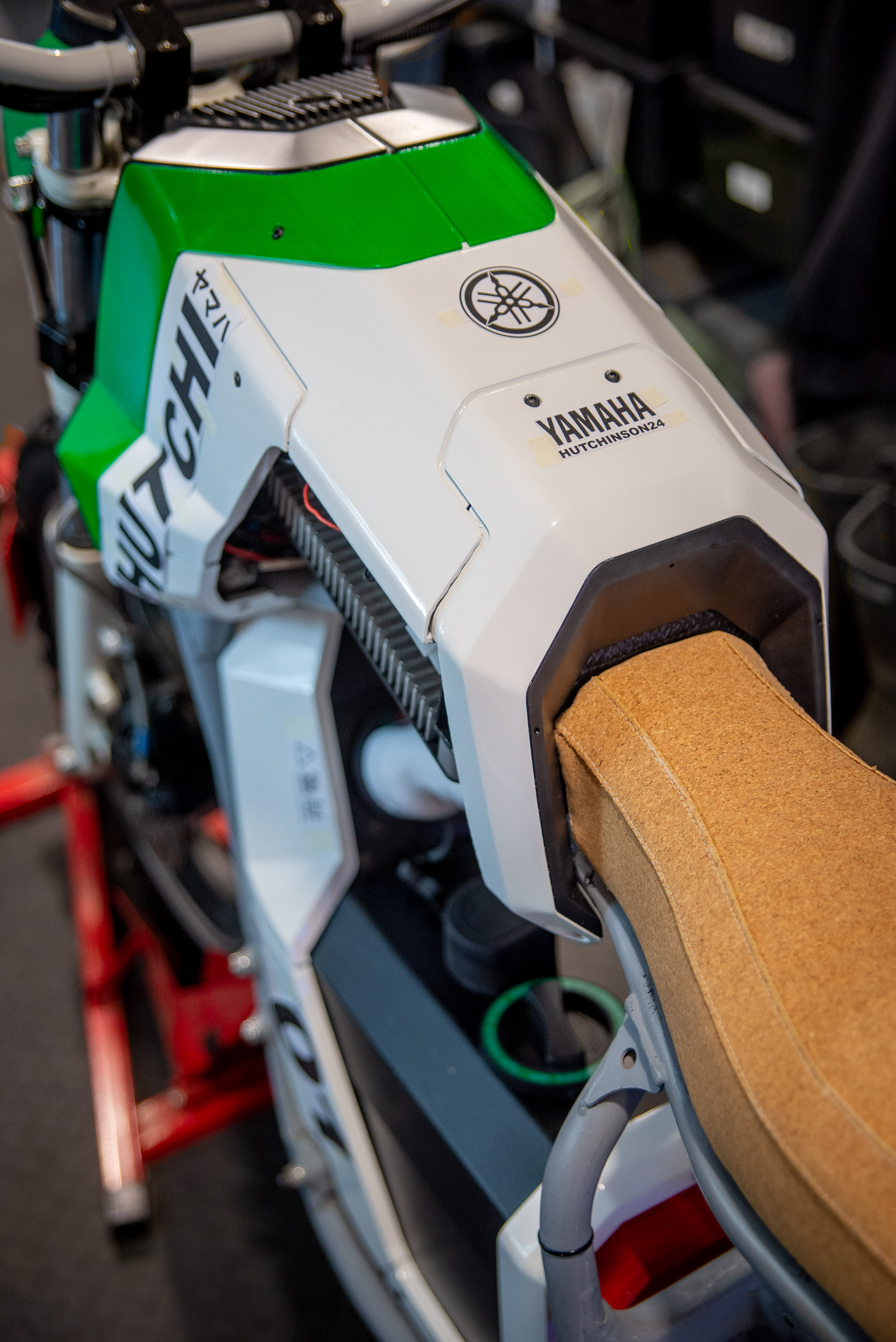
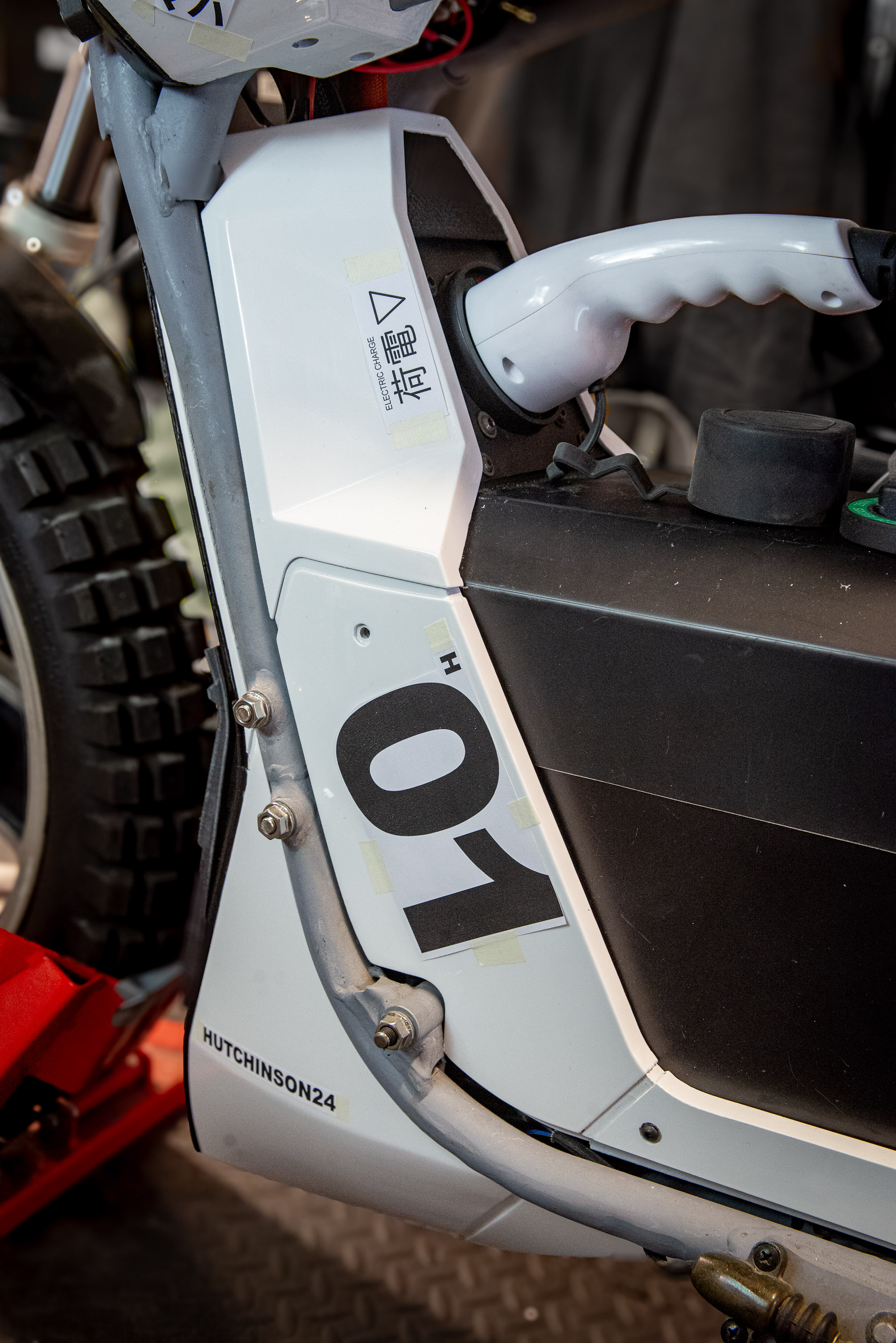
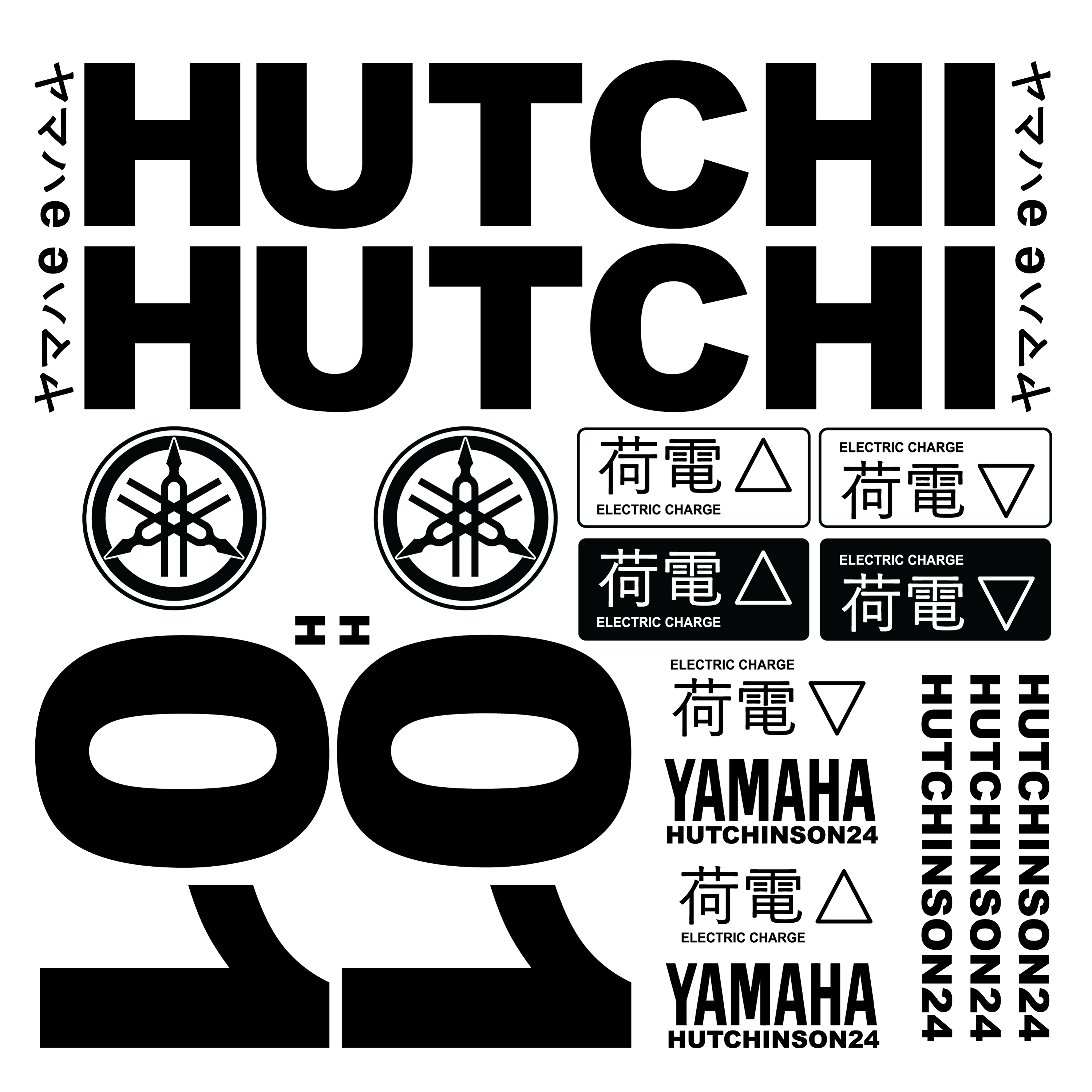
As it was a Japanese bike originally I thought I’d use that as a theme using Japanese translations for unique area such as the charge point, and the main side graphic ‘HUTCHI ヤマハ e’. The ‘e’ referring to it’s new fully electric identity and ‘ヤマハ’ being Yamaha spelt using Japanese characters. Thought I’d keep it simple though because being a non-Japanese speaker I’m just asking for things to go wrong regarding meanings of words. On the main graphic I thought I’d go for a large bold style of lettering, similarly on the prototype h-number to give it a racy look.
Just need to source a provider now. Main problem is the variation in letter sizes. Which means I might need to choose a mix of vinyl die cut large letters/lines and custom vinyl digital printed stickers for the smaller letters/lines that a blade couldn’t easily do.
I loosely hung the panels on the bike (before it is disassembled to get the frame finished) and stuck some mock paper cut-outs to visualise the layout of the decals. Looks like it could work, will have to see.